
In the early days of the World Wide Web, the fonts you saw on your screen would depend on your computer’s operating system. Initially, a sans serif font would probably appear as Arial on a PC and as Helvetica on a Mac. A little later, Microsoft began to add a wider choice of fonts designed with web browsing in mind, notably Verdana, Tahoma and Trebuchet, which were all released in the mid-1990s.
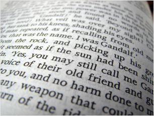
Serif fonts have little bits sticking out of the ends of the letters.
Sans serif fonts don’t have these bits. They’re straight up and down.
Throughout the first decade of the 21st century the situation remained largely unchanged. While printed literature was a wonderland of typographical variety, text on the web all looked much the same.
In 2009 Swedish retailer Ikea upset many in the design world when it switched the typeface in its print catalogue from Futura to Verdana, out of a desire to homogenise its brand identity across all media. The internet tail now seemed to be wagging the print dog.
Just one year later Google changed the world of web design forever when it launched a range of 19 fonts that its servers would render on-screen without them needing to be present on the user’s system or hosted by the website itself. “Google has a knack of being able to bring new technologies into the spotlight, so there’s no doubt we’re going to see a much ‘font-ier’ web over the next 12 months,” said Alex Walker soon after the launch. That turned out to be an understatement.
Strictly, a font is a specific variant (e.g. italic bold) of a typeface. But the two terms are widely used interchangeably nowadays.
Now there are more than 1,600 Google typefaces (aka font families) to choose from, and hundreds of millions of websites using them. Most of these sites rely on a handful of sans serif stalwarts, notably Roboto, Open Sans and Lato.
Other popular choices include Raleway, Montserrat (particularly for its huge range of weights), Poppins and Nunito.
Google has recently been promoting Noto Sans and Noto Serif, which are based on Droid and aim to include every possible character in the international world of type. It’s a good clean font family and if your website features (or might someday feature) some unusual glyphs it would make a sound choice.
Google fonts categories
| Serif | Playfair Display | 6.2m sites |
| Sans serif | Roboto | 660m sites |
| Handwriting | Dancing Script | 730k sites |
| Monospace | Roboto Mono | 530k sites |
| Category | Most popular | Usage |
|---|
Paid-for fonts
Google didn’t actually invent the technology that would render any typeface on any device. Adobe’s Typekit option arrived a few months earlier. But it cost money (except for a limited no-charge option) and Google’s alternative was entirely free – though some suspect it may not stay that way forever.
Today there are multiple vendors of web fonts offering many thousands of typographic options at a range of prices. Depending on the vendor and the typeface there are various ways you can be charged for a web font, including a one-off fee or a pay as you go arrangement. Even under the latter, a small trader’s website might never need to make a top-up payment. But, either way, displaying a paid-for font would probably cost you at least £100 (including italic and bold versions).
There are also apps that will allow you to upload a font you’ve previously installed on your computer, which will then be converted to Web Open Font Format so that you can embed it on your website. However, the resulting quality is often inferior to the professionally hosted alternatives. That may not matter too much with a big bold font but lighter weights can look rough around the edges.
I haven’t had a client yet who’s thought it was worth paying for a particular web font. But I’m looking forward to the day that changes because a distinctive typeface can make a lot of difference to a website. To mention a couple of examples:
Starting with its sports pages, the BBC is presently rolling out the use of an in-house font called Reith, which is moderately pleasing and highly legible, if a little bit childlike. If you want a free font like this, I suggest Google’s ABeeZee, which was developed as a children’s learning font.
Among commercial sites, NetDoctor is an admirable example of an informative website that stands out from the rest because of its idiosyncratic choice of fonts: the serif and sans serif versions of Museo.
If I could afford it, this site would all be set in Cronos – the typeface I’ve used for my ‘Web Design’ logo (complete with its shooting star ornament/dingbat). Instead I’ve mostly used Open Sans or Source Sans.
Serif or sans serif?
In the world of printing on paper it’s received wisdom that serif typefaces are easier to read at small sizes. When did you last see a book set in a sans serif typeface? (Whatever it was it probably wasn’t a classic.)
For a while it was believed this easier-reading axiom applied to the web too but research now indicates otherwise – especially after so much behind-the-scenes work has been done to improve the way type is rendered on-screen.
Most websites nowadays use sans serif fonts throughout. But there’s no harm in making some use of serif fonts, whether for a bit of variety or perhaps to add some gravitas to your site.
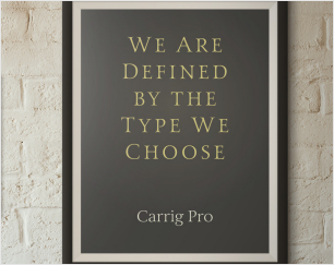
Caps or not?
In certain contexts, especially online conversations, the use of all caps is frowned upon severely. Some websites avoid it too. I have a friend who steadfastly refused to use upper case anywhere on his site; not in headlines or sub-heads or his logo. “I don’t want to shout at my readers,” he insisted. I persuaded him to reconsider.
Nowadays the use of all caps in headers is the norm. Very few people are offended by upper case headlines and they tend to look neater, unless they’re in a heavy weight. However, all caps should always be avoided in body copy. For emphasis, use italics. For extra emphasis, use bold. Avoid underlining though, because the text could be confused for a hyperlink.
Incidentally, the use of all lower case in headlines is considered cool only by people who aren’t actually very cool. Or so I believe 😉
